photographing a smart city

MK:Smart is a large ‘smart city’ project based in Milton Keynes in the UK.  It’s hosted by my home institution, The Open University.  Its core work package when it was set up was the development of a open data hub: an repository of all sorts of big data about Milton Keynes, accessible to anyone.  As the project has developed, though, its efforts to enable local people to engage with such an open data source have increased.  One of these efforts is the website OurMK, and the project team also does lots of outreach in local schools.  You can find about more about their work to facilitate ‘smart citizens’ here and some of their publications are listed here.

As part of this engagement work, the MK:Smart team launched a photography competition in December 2015, with prizes for the best photographs picturing Milton Keynes as a smart city.  You can see the finalists here.

I think these photographs raise some fascinating questions about how a smart city is visualised by its residents (or, more accurately, what the judges thought were the best ways some residents had pictured a smart city).  Nineteen photographs made it to the final stage – not many, so I should be careful about drawing any big interpretive conclusions from them.  On the other hand, as I’ve remarked before, one of the liberating things about writing a blog is that sometimes the robust methodological procedures of the social sciences can be laid to one side and a little more speculative thinking permitted…

Car Park Drama

Car Park Drama by Suzanna Raymond. Suzanna’s caption read: The way the car park is integrated into the shopping centre looks like a smart design to me, making it an integral part of the layout rather then just a space added on as an afterthought.

So one thing that struck me immediately about these nineteen was how so many of them focus on the landscape of Milton Keynes, and especially on its ‘natural’ landscape: trees, parks, canals, lakes, skies.  There are no pictures of servers or data hubs or smartphones (though there are two photos of electric car charging points, one of a bus charging wirelessly and one of solar panels).

This preference for picturing a smart city as a green city perhaps speaks to the distinctive history of Milton Keynes.  Milton Keynes was designed as a new city in the late 1960s and early 1970s with plenty of experiments in (and symbols of) more sustainable living: houses powered by solar energy, cycle ways paralleling the roads, a dial-a-bus service, a tree cathedral… the whole city is full of trees and parks and is oriented along a ley line! Milton Keynes has a strong sense of itself as green, then, and these photographs might be speaking to that sense of place. The photos perhaps also draw on a rather English preference for rural landscapes, gardens and parks.

The other thing that struck me about the photographs was the way they display the sort of visual aesthetic that seems increasingly common in many digital images, which is a kind of glow against darkness, whether that’s lights gleaming at dusk or (elsewhere) live data feeds pulsating across a black background.  No less than seven are taken around sunset, and one more makes a striking play between a sky darkened by clouds and a golden building.

So, possibly, what we have in this admittedly tiny sample of photographs is an interesting play between what someone like Lev Manovich might suggest is an increasingly widespread visual aesthetic, driven by the extensive use of digital image creation/editing software – even a global visual aesthetic – and something that’s may be much more local, attuned to the specific histories of this particular city and its sense of place.

Now, of course, as Doreen Massey would immediately have pointed out, there’s no clear distinction between the local and the global.  Many of the ideas behind Milton Keynes, and implicit in its first visualisations, were imported by its architects from the west coast of the USA, for example, and I’ve already suggested that a love of rural landscape may be as much English as anything to do with Milton Keynes.  But it’s precisely this play between the new and the old, between existing ways of seeing and of making images with new ways of seeing and making, that I find so fascinating in this small collection of photographs.


Big Bang Data: some thoughts on an exhibition

I had a lot of fun a couple of weekends ago at the Big Bang Data exhibition.  It claims to show “how the data explosion is transforming our world”, and if it doesn’t manage quite that, it’s certainly worth a visit.  It’s on in London and its run has been extended to 20 March – not surprisingly, as it was packed out on the Saturday afternoon I visited.  Its website has lots of materials on things that are in the show if you can’t make it to London.

bigbang 2

There’s lots to say about it.  After a couple of artist installations to kick things off (Timo Arnall‘s Internet Machine and Ryoji Ikeda‘s gorgeous, entrancing Data.tron – and We Need Us by Julie Freeman is installed towards the show’s end), the exhibition was divided into zones that reflected pretty accurately a number of current academic ways of thinking about digital data: the materiality of ‘the cloud’; the ‘quantified self’; the massiveness of ‘big data’; ‘data for the common good’, looking at participatory uses of data and digital devices; ‘data is beautiful’.  Each zone was full of examples of different kinds of engagements with digital data, by artists and designers and activists, and there were also a few (rather gestural) citations of earlier, pre-digital examples of images doing apparently similar things.  There was also a massive ‘London Situation Room’, with a number of very large projections of various data streams from the city by Tekja, as well as two consoles with interactive screens of various kinds.

london data streams tekja.jpg

London Data Streams by Tekja

The variety was fascinating.

However, the variety also served to obscure what I felt by the end was actually a rather uncritical approach to digital data.  Continue reading

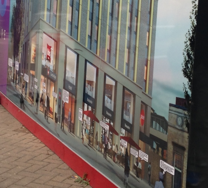
spotted at Cambridge station – cut-and-pasted people talk back!

I always keep my eye out for building site billboards and their shiny (or not so shiny) digital visualisations to add to my collection, but at Cambridge station on Saturday I got a surprise. Someone has added speech bubbles to the figures cut-and-pasted into this hoarding.

IMG_1141 copy

I took the photo above in June; below is the hoarding on 17 October.

IMG_1268

And here are some of bubbles in close-up.

IMG_1266

IMG_1265 copy 1

IMG_1265 copy 2

IMG_1267 copy

And finally, one that not many critics of this sort of glamourising of urban redevelopment schemes seem to consider:

IMG_1264 copy

I have no idea who made this intervention, but my hat goes off to you.

Mad Max and its feminist fans

Of the many reasons to be grateful for the journalist Laurie Penny, her review of the movie Mad Max: Fury Road now ranks pretty high for me.  Thankyou Laurie – and Jessica Valenti – for tipping the guilty pleasure of the film much more towards the pleasure than the guilt, by writing fantastic reviews that suggest it’s a really feminist movie.  There’s also a great Tumblr site giving Max new lines, all feminist-y too.

FURY ROAD

The bit I would add to support this reading of the film is when Max sees the five scantily-clad women escaping the mad patriarch washing themselves in the desert haze – I know, I know, but bear with me – whereupon he kind of blinks, like this is a totally stupid hallucination (like his others), entirely irrelevant to the task at hand, which is dealing with the woman who’s engineered their escape.  He doesn’t ogle, doesn’t look, doesn’t even think such a vision can be real.  Woo hoo.  (Unfortunately, not all viewers may share my interpretation of this scene; my 17 year old son among them, who pointed to it as evidence that the film was indeed sexist.)

Ultimately, though, the burning Mad Max question is: how does a professor get to be listed in a Mad Max film credits?!  I swear I saw two profs thanked as the credits rolled.  Who are they, what did do they do to get thanked, and (depending on the answers), can I do it too please?

the production, composition, audiencing – and circulation – of images

I’ve been spending the first few weeks of this year thinking about how to revise my book on Visual Methodologies for its fourth edition.  Among other things, I’ve been thinking about what difference digital technologies – as both topic and tool – are making to its arguments.  And I’ve decided on at least one significant change for the fourth edition: the three sites through which the book organises its discussion of visual methods are now four.  The site of ‘circulation’ has been added to the sites of the production of an image, the image itself, the site(s) of its audiencing.  ‘Circulation’ is intended to emphasise that all images, to some extent or another, travel.  Images are mobile, and how they travel matters to what effects they have.

This isn’t an insight created by the development in the past few years of massive, extended social networking sites that now carry vast numbers of images between all sorts of different screens.  In fact, the keyword that I’ve attached to it in the book is the idea of a “visual economy”, which comes from anthropologist Deborah Poole‘s book on the way images travelled between the Andes and Europe between the seventeenth and the early twentieth century.

However, I do think that there are some methodological issues involved in looking at – or even thinking about – those huge hoards of online images that require an emphasis on their circulation.  I think it’s important that we pay attention to the work that goes into enabling that circulation, for example, in the workplaces where the labour is done to make those platforms feel so easy to use: the coders and the checkers, the servers and the cables.  Also, images on Instagram or Twitter or Facebook aren’t stored in some ginormous virtual contact sheet, and not every image has an equal chance of appearing on a Google Images search result screen.  Instead, how those images get seen is shaped by algorithmic patterns.  Search results are shaped by your previous searches, by your location, by what other people are also searching; and what you see on Instagram, Facebook and Snapchat also depends on your social network.  I think we need to figure out methods that can show us, somehow, the patterns and processes through which those image collections are structured, just as twenty years ago Foucauldian historians like John Tagg and Alan Sekula showed us how filing systems and labels organised earlier forms of photography archives.

This is a problem with Lev Manovich‘s cultural analytics, I think: it engages with the huge numbers but does so by adding them all up, and creating collages of the total.  This shows us some interesting things – what Tokyo looks like in 50,000 Instagram images is provocative in terms of thinking about what a photograph now is, I think – but it doesn’t engage with the uneven distributions that shape the circulation of social media images at all.

50,000 Instagram photos from Tokyo, organized by brightness mean (radius) and hue mean (perimeter).

50,000 Instagram photos from Tokyo, organized by brightness mean (radius) and hue mean (perimeter). from phototrails.net

I don’t know where methods might be emerging from that could do that, or what they might look like, though – so please post a comment below if you do!

we’re all cultural studies scholars now?

Rather belatedly, something interesting struck me about the furore in the UK a week or so ago over a tweet sent by Emily Thornberry, now the ex shadow attorney general.  For those of you with short memories or not UK-media-aware, Thornberry’s tweet was criticised for being contemptuous of working-class voters, and she resigned from her shadow cabinet role after a couple of conversations with her party leader.

Here is the tweet (and notice the text as well as the photo):

thornberry

In the online discussion of the tweet, loads of things were happening, of course, but there was something about the whole dynamic of the discussion that I thought was intriguing: the way the tweet swung in and out of being seen as ‘representing’ something.

On the one hand, there were a lot of claims – including by Emily Thornberry herself – that the image was meaningless.  It meant nothing; the scene had just struck her as something that could be shared on Twitter.  Now, we could discuss the conditions under which certain things become noticeable and photographable, of course, but still, given how so many photos are put onto social media in just that way, not as meaning anything, just as a sort of ‘oh look’ statement, ‘I am here’, ‘that is here’, I think her claim has some credibility.  Perhaps it really wasn’t an image that meant anything, it wasn’t symbolic, it was purely descriptive, just a picture of a van and flags, a pure “Image from #Rochester”.

Its status as pure description also prompted a lot of online discussion about how photographs become meaningful rather than inherently carrying meaning as well.  So on the other hand, huge amounts of online work went into interpreting the meanings the tweet implied.  The flags, the van, the location: all were decoded, re-coded, explicated, interpreted, repeatedly, by very very many people.  And so were the processes through which all that interpretive work was being done, because there was also a lot of discussion about the sort of coverage given to the tweet in and by different media outlets.

Noortje Marres has been interviewed on the excellent LSE Impact blog about digital sociology, and a point she makes very well there is that the tools and techniques of  social analysis are now widely distributed among many kinds of social actors.  As she says, “social actors, practices and events are increasingly and explicitly oriented towards social analysis and are actively involved in it (in collecting and analysing data, applying metrics, eliciting feed-back, and so on)”.  She is particularly referring to the digital tools embedded in social media platforms, the internet of things, online transaction databases and the like.

But one of the things that the Thornberry tweet affair made evident to me was that the same might be said of the tools of cultural interpretation.  Textual and visual analysis, and an understanding of the significance of the role of the media – in the strict sense of the term – are alive and kicking pretty much everywhere, it felt like, as the vigorous debated unfolded.  The furore was a sort of mass cultural studies seminar.  And if cultural studies has gone viral, what are the implications for those of us who do it – possibly more carefully, certainly much more slowly – in the academy?

on tinkering with digital debris: the work of Hito Steyerl

I picked up a copy of Hito Steyerl’s book The Wretched of the Screen at the ICA bookshop in London when she had an exhibition there a few months ago.  She’s a video artist based in Berlin and her work is a brilliant commentary on the mediation of different kinds of visuality by digital technologies.  The most interesting piece  in the exhibition for me was called How Not To Be Seen: A Fucking Didactic .Mov File; you can see part 5 here.  It’s very articulate about the co-implication of digital cameras, image resolutions, entertainment and advertising (including, yes, architectural visualisations!).  It’s also kind of funny and downright weird in places, which disrupts the very easy binary model that so much current discussion about digital technologies and big data seem to be falling into, ie surveillance versus privacy, privacy versus open access, participation versus surveillance, etc etc etc.  Steyerl makes it all a bit less easy than that; her movie is in some ways actually not very didactic.

e-flux_Hito-Steyerl_364The book, which I’ve finally started reading, does a similar thing.  I haven’t read it all yet, but the opening chapters are very stimulating, especially the essay ‘In defense of the poor image’.  Steyerl talks there about the millions and millions of poor quality images that now circulate: aesthetically banal, low resolution, copied, compressed and altered, valueless debris that whizzes around the internet, “the trash that washes up on the digital economies’ shores” (page 32).  As, she says, it is precisely their compression and speed of travel that makes this sort of image ideally suited to the contemporary visual economy in which attention is minimal and novelty is all.

But Steyerl continues, exploring how their dispersal across circuits of mobility also produces networks of viewers, spectators, who can dip and shift and alter poor images to suit their own ends.  Her account doesn’t evoke a radical grassroots challenging the digital corporations, so much as a rather aimless browsing and tinkering, which may or may not produce effects, further circulations, that might, or might not, be inventive of something new.

This seems to me to be closer to what’s happening now than the us-versus-them analyses that appears so common in discussions of big data and smart cities.  If we need to learn not to see high end glossy digital images as perfect images of perfect things – as I argue with Monica Degen and Clare Melhuish in our recent paper – maybe we also need to learn not to see poor images as too valueless to have effects.


the methods of Visible Mending

I’ve just been browsing through the book Visible Mending: Everyday Repairs in the South West by Steven Bond, Caitlin DeSilvey and James Ryan.  It was published by Uniformbooks earlier this year and is the result of a research project exploring workplaces in the south west of England where people repair things.

vmcover

The book is beautifully designed and produced and full of Steven Bond’s fantastic photographs, which linger on the objects and spaces and light of the workplaces the research team visited.  As Caitlin and James say in their essay that concludes the book, the photographs really do focus attention on the richly textured materialities of these places, and suggest the intimate relations between them and the people who work there, even though very few of the photographs picture people.

That concluding essay is also ponders nicely on the use of photographs in the research project: how they were taken and what was done with them.  I particularly like the reflection on the materiality of the photographs in the exhibitions that Steven, Caitlin and James curated.  They note that the photos seemed to sort themselves into thematic groups, and the researchers went with that clustering, and also decided to print the photos on small metal sheets that could be picked up from the tiny shelves on which they rested in the gallery and held and explored (how does a photo get printed on to aluminium?); the essay also explores the different forms of text that accompany the photographs, in the book, in the guide to the exhibitions and on the project’s blog.  There’s a strong sense of the academic craft in all this, of methods as labour and work.  Lovely.

photography, motherhood and identity

There’s a great exhibition on at The Photographers’ Gallery and the Foundling Museum in London at the moment – it runs til 5 January.  It’s called Home Truths: Photography, Motherhood and Identity, and it “aims to challenge long held stereotypes and sentimental views about motherhood”.

motherhood

I visited The Photographers’ Gallery at the weekend to see the photographs there.  I’ve blogged before about the way that this gallery erases any discussion of the production of photography by hanging photographic prints with minimal commentary on its white walls; on this occasion though, for me at least, the photographs seemed to hold their own against that abstracted context and were for the most part very powerful.  Most spoke to me about the complexities of mothering, and how being a mother is also in part an erasure of the person you were before you gave birth.

I also went to a talk with three of the photographers in the show: Elinor Carucci, Ana Casas Broda and Katie Murray.  They were all very articulate about the difficulties of being a photographer and a mother – not least the practical difficulties of taking the kind of photographs they wanted to make of themselves with their children.  Both Elinor and Ana said that of course they used digital cameras for this work, analogue cameras just took too much time to set up and with kids you had to take the shot as fast as you could.  The talk, then, focussed very much on what the exhibition studiously ignored: the labour of making images.

One thing that did strike me about the exhibition was that all the work was very far from the kind of traditional ‘family photography’ that I’ve written about elsewhere.  The work was in very large format, or in rigorous series, or shown in vitrines, or way too explicit for the family album.  One of the arguments of my book, though, is that even the much less aesthetically impressive family snaps that so many women take of their kids might also be seen as expressing certain forms of ambivalence: in mothers’ insistence on taking them; in the way they are gathered together and narrated by the mother; the way they are looked at and then put away by the mother.  Perhaps not in what they show, but rather in what is done with them, family photos also are less sentimental than is often imagined.

let’s genesis blue sky thinking going forward for key stakeholders

I haven’t been posting on this blog for the past few months as often as I did when I started out.  Mostly because the part of my job which isn’t research has been particularly demanding recently: lots of management – sorry, ‘leadership’, stuff.  So for anyone else in the same position – doing admin work rather than research work – here is something that made me laugh out loud.  It’s a list of management-speak, from the Guardian newspaper last weekend.  The comments below the article are even better.  And my faculty’s brilliant Senior Administrator let slip another one yesterday: ‘to genesis’, a verb meaning ‘to originate’, as in ‘if you genesis that report I will revise it’.

The article is also a good example of the Guardian‘s need to locate a photo – any photo, no matter how weakly related to the news story – to head up each of its articles.  An example of the sort of ubiquitous photo that Martin Hand’s recent book discusses, and also an example of how interviewing viewers of that page might not be the best method to address the effect of that sort of photo.  What on earth is there to say about it, after all?

And here, then, is an image from BishopBlog that is entirely unrelated to the fantastically enlivening ways in which I have been spending my time not doing research, or blogging, for the past few months, with my actually very lively and wonderful OU colleagues.

REF