Conceptualising aesthetic power in the digitally-mediated city

Happy to report I have a new paper out, co-authored with Monica Degen. It’s online and open access at Urban Studies and this is the abstract:

Aesthetics, generally understood as an intensified emphasis on the sensorial look and feel of urban environments, has become an important perspective through which urban scholarship is examining the economic, social, political and cultural processes of urban regeneration projects across the globe. Much of this aestheticising work is now mediated by many kinds of digital technologies. The entanglement of digital technologies with the sensorial feel of urban redevelopments manifests in many different ways in different urban locations; it is deeply reshaping the embodied experiencing of urban life; and it enacts specific power relations. It is the focus of this paper. Drawing on the work of Lefebvre and Jansson, this article develops the notion of ‘textured’ space in order to offer an analytic vocabulary that can describe distinctive configurations of urban experience at the intersection of specific urban environments, bodily sensations, and digital devices. Analysing embodied sensory politics is important because various aspects of bodily sensoria are central to human experiences of, and relations between, both self and other. Hence bodies are enrolled differentially into different expressions of these new urban aesthetics: while some are seduced, others are made invisible or repelled, or are ambivalently entangled in digitally-mediated aesthetic atmospheres. The article offers some examples of the power relations inherent in the textured aesthetics of three of the most significant, and interrelated, processes of contemporary, digitally-mediated urban change: efforts to be seen as a ‘world-class city’ and to facilitate gentrification and tourism.

It takes the argument of our book The New Urban Aesthetic a bit further by drawing on an excellent range of studies by other scholars to look more carefully at the embodied power relations implicit in different examples of digitally-mediated urban aesthetics.

The Kitchen: a review

The Kitchen is a new Netflix movie, directed by Daniel Kaluuya and Kibwe Tavares. It’s an excellent addition to the genre of film in which a working-class London neighbourhood is invaded by hostile outsiders (see also Attack the Block (“INNER CITY VERSUS OUTER SPACE”) and Cockneys versus Zombies (“This city ain’t big enough for the both of them!”), both made around a decade ago).

The Kitchen in the movie is a housing estate in near-future London. Netflix bills The Kitchen as sci-fi, but the Kitchen’s invaders aren’t aliens, as in Attack the Block, or zombies: they’re the police enforcing the evictions that’ll allow the Kitchen to be redeveloped. Zombie and alien invasion films are often taken as metaphors for contemporary concerns: nuclear war, capitalist alienation. In the case of The Kitchen, though, the invasion and destruction of poor neighbourhoods by property capitalism is not allegorised in any way: it is made viscerally real.

This literalism reminded me of something NK Jemisin wrote about her two Great Cities novels. Those books are also about a city being invaded (New York), this time by an actual alien (you know what I mean), and the alien is both convincingly real in terms of the story and clearly metaphorical: white, tentacular, extractive, plugging into bodies and minds to render resistance useless. There are certainly many analogies at work in these two books: the first especially is a great, challenging read. At the end of the second book, The World We Make, Jemisin explains that she intended to write a third but by the time the first was finished, what was actually happening in New York had outstripped satire. “I had to change one of my initial planned plots for this book—a monstrous president waging war on his own hometown—because Trump got there first,” she says. “The Great Cities trilogy that I’d initially planned became a duology because I realized my creative energy was fading under the onslaught of reality”

While it certainly can’t be accused of lacking creative energy, I got the feeling that as a creative intervention, The Kitchen occupies a similar relation to urban change in cities like London and New York, and many more, as do the Great Cities novels. The movie clearly didn’t lack the budget to show aliens or zombies, because the digital visual effects are impressive, but it chose not to: economic, social and political relations and dynamics clearly understandable from our contemporary moment are frightening enough.

I can’t close without saying more about those visual effects, because they are both part of the film as it’s meant to be seen by us spectators – they visualise the near-future city of which the Kitchen is part – and also because onscreen digital images play a role in the film’s narrative. Lots of critics have remarked on the film’s VFX and they are very good. London’s existing built environment seems to have been intensified: the London Eye has been upgraded; the skyline has even more striking tall buildings; the Kitchen is a huge building over which drones hover and sweep. Watching on a tv screen I could see how that urban landscape would scale up impressively in a cinema. There are smaller pleasures too: the vibrant market of the Kitchen has lots of floating glowing signs which look rather lovely; bits of what I looks very much like the actual Barbican complex in London have been modified to become a crematorium (maybe that’s metaphorical).

Digitally-produced images of cities also feature in a key scene in the movie where one of the main characters finally accesses a new apartment provided by the company wanting to redevelop the Kitchen. There’s no actual window in the one-room apartment (the decor of which looks very much like what’s pictured in endless CGIs of new apartments now). Rather, there is a wall-size screen with a selection of aerial urban views of exactly the same kind that property developers now frequently use to sell their apartments: a view from on high of a city at dusk, lit buildings twinkling like urban fairy lights. And the streets of the London we see in the movie are full of billboards picturing new developments in just that style. So it’s not just the physical landscape of this London that’s being reshaped by big developers, but also its visual culture.

I’m probably a bit over-focussed on such things, but it did seem to me that there was a strong and interesting convergence between these computer-generated marketing images and how the city as a whole was pictured in The Kitchen. The VFX are good but they’re not quite at the level of Dune, say, or The Creator, or San Andreas. There was a slightly sketchy quality to them, a slightly washed-out, pale colour palette. While this did make me wonder that perhaps future London has at least benefited from being a low emission zone, I was also strongly reminded precisely of the computer-generated images frequently used by property developers, pitching their apartment blocks in the ever-sunny uplands of property-owning capitalism. Just like the characters are only offered CGI views when they leave the Kitchen, then, so too it felt that as viewers of the film, our vision of the city also has been infected by real-estate-VFX.

There’s a lot more to say about the film, of course. Fantastic acting, rather slow pacing but with some great set pieces, fails the Bechdel test. It’s a fascinating watch, and has certainly given me a lot of food for thought as I ponder the implications of various digitally-created images of urban life.

‘Beyond the page’ and beyond geometric perspective

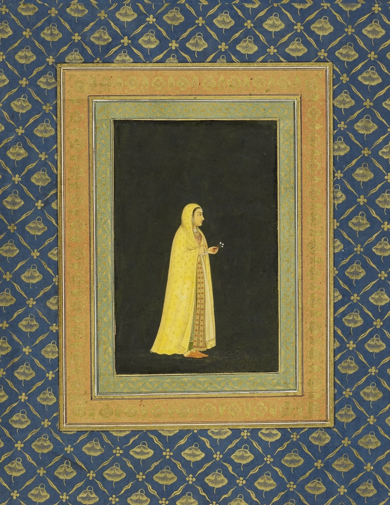
I went to see the exhibition Beyond the Page: South Asian Miniature Painting and Britain, 1600 to Today yesterday, at MK Gallery in Milton Keynes. The show was fabulous – it ends on 28 January so go if you can.

At the core of the exhibition are the ‘miniatures’ (actually sometimes quite medium-sized) painted on book pages by artists working in South Asia from the seventeenth century onwards, and some of the diverse work that kind of painting has inspired, from artists exploring them in London museums in the twentieth century searching for forms of visual resistance to colonial rule, to later artists also intrigued by their formal qualities.

Unknown artist, A late Mughal Album of Calligraphy and Paintings, c.1720-1740

One of the exhibition’s many pleasures is its concern to emphasise that this tradition of painting was in dialogue with other forms of visual art practice from 1600. One miniature has a crowd of very European angels lurking in its clouds for example; there’s also a large canvas by a seventeenth-century Dutch painter bringing the Netherlandish ‘art of describing’ to Mughal carriages made of composite images. This is hybridity as weird and wonderful.

The exhibition also served to remind me how very specific Western techniques of geometric perspective are. I don’t think any of the images in the exhibition used any of those techniques to organise their space. Even a video had been edited so that four boats apparently filmed on a river together floated among patches of ripples in a larger blank space. I’ve been thinking quite a lot about geometric three-dimensional space and its organisation of the visual field recently, since so much digital imagery builds on that geometry; here is a visually compelling exhibition which for the most part (the Dutch canvas excepted, I think) works in very different spatial registers which seem to hold much greater potential for spatial and temporal multiplicity.

I’m going to try to be more active on this blog this year (I know I said that last year…) and reviews are one way to do that. I’ll try to give you more notice of excellent shows in the future though…

picturing suburban utopia

The images in a newspaper report about plans for a “55,000 acre utopia dreamed by Silicon Valley elites” caught my eye at the weekend. The ‘utopia’ is called ‘California Forever‘ and its promotional images are striking. They’re a kind of 1930s graphic-cum-landscape, pastel colours, little shading. Bits remind me of iPad painting software, others of English interwar driving guides. But mostly I thought – they must be generated by AI, a generative AI like Midjourney, Dall-E or Stable Diffusion.

I think there are two reasons for this. One is the visual content. There are weird shapes in every image: look at the green things on the roof of the building in the image above. There’s a canoeing scene in which the figures in the kayak are splodges and the daisies next to them oddly large. In fact, in each of the images on the California Forever website I spotted some strange shape which doesn’t work as a representation of even an imaginary urban space.

Also, there’ is a slightly odd ‘utopia’ vibe to the images which is not dissimilar to something Roland Meyer has identified as typical of Midjourney’s generated images. As Roland has demonstrated, Midjourney seems to like an early- to mid-20th century US public visual culture style (with apologies to any art historians out there wondering what on earth I’m talking about). It’s kind of heroic public art/messaging, but more suburban and, as Roland also showed with his image of a ‘family barbecue in a redwood valley’, with very traditional social content: white straight families, in Roland’s example. Roland also shows how Midjourney’s images can become really strange if expanded. These images of California Forever are much less surreal (overtly anyway); it’s all pastel colours and sunshine and sunsets (hence my reference to a certain kind of English interwar aesthetic). But the very conventional and normative social content remains, albeit specifically West-Coast-ised. It’s all very trad, men installing solar panels, women chatting in the town square. And no mention, textual or visual, of the Patwin tribe who lived on the land when the Spanish arrived.

Why use this visual style? Well, one thought is that there is one other recent proposal for a very large-scale urban redevelopment project which also promises to bring a green utopia to a dry land: Neom’s The Line. When I’ve given various talks about the digital visualisation of new urban development projects, it surprises me how many people mention The Line – and not in a good way (see too the comments made about its YouTube promotional video). The many criticisms of this sort of urban utopia vision might have fed into existing widespread scepticism about computer-generated images of new urban redevelopment projects that go for the ‘photo-real’ sort of look that the Neom promotional materials adopt (although always saturated with a golden glow – there’s something to say here about the aesthetic that Unreal Engine has enabled, I think, too). They are perhaps beginning to look more absurd and even offensive than simply a bit of typical marketing to be cynical about. So maybe the developers of ‘California Forever’ want to distance themselves from that critique and that visual style. (I recall that Google’s images for its ill-fated Sidewalk project in Toronto also used what looked like pen-and-watercolour sketches as well as CGIs in their publicity materials, perhaps for the same reason.)

There are surely other reasons too, though, for the use of these visuals. Not least, that using AI to generate these sorts of illustrative images – if that’s what was done – is surely much cheaper to the developer than paying a visual artist to do the work.

But also, if, as Roland suggests, all you need is a vibe from your image, then AI is your tool. And since urban (re)development is increasingly working with the aesthetic and atmospheric (as Monica Degen and I argue in our book The New Urban Aesthetic), then vibe is indeed what you need. So it’s an interesting moment for the production of images of new development projects. Accuracy or vibe? But of course both are now produced digitally so in some ways it’s no choice at all.

Oppenheimer: Man, man and oh man…

Yes, I’ve been to see Barbie and Oppenheimer. Here are some thoughts on the latter. Well, one thought really: Oppenheimer the movie is so deeply wedded to the idea of the white straight male scientist hero that it gives its lead actor no room to manoeuvre. We get Oppenheimer the Tortured Youth, plagued by visions of Physics and Molecules and Atoms and Energy (beautiful and a bit overwhelming, admittedly); then we get Oppenheimer the underestimated Scientific Genius at Berkeley; then the inspirational Leader, motivating crowds of young men, mostly, at Los Alamos; we also get Oppenheimer the manly Man, having sex with pretty much all the female characters who actually get to talk in the movie (all three of them); then we get Oppenheimer the Tortured Genius, having Moral Crises while not, in the end, becoming the victim of a petty bully hoorah.

This is all done with the utmost seriousness: there is no suggestion that lives can be shaped through such discursive figures but not reduced to them. There is no irony or self-awareness. It’s actually a really grim vision. Given all the discussion about feminism and gender swirling around Barbie, the lack of discussion about Oppenheimer‘s view of masculinity is disappointing, to put it mildly, especially given that several of the masculine figures the film works through have have appeared recently in various discussions of AI. I despair. (And I imagine so too do many actual scientists.)

the limits to ‘invisuality’ and ‘postrepresentation’?

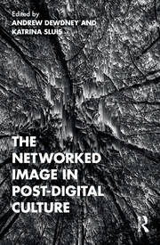
I read Andrew Dewdney’s chapter in the new book he’s edited with Katrina Sluis called The Networked Image in Post-Digital Culture last week, for a discussion with the fab TRAVIS research team. Dewdney’s chapter is a very useful read – he summarises several of the statements about digital imagery that I’ve returned to repeatedly in my own work, and takes them and their assumptions forward to a specific critical position. The chapter covers a lot of ground, and I’m just going to say something here about how it brought into focus some of the limits of those statements for me.

The key references Dewdney discusses in his chapter include the book Softimage: Towards a New Theory of the Digital Image by Ingrid Hoelzl and Remi Marie, the essay in Theory, Culture and Society by Adrian Mackenzie and Anna Munster on platform seeing, various pieces by Jonathan Beller, a chapter by Daniel Rubinstein and Katrina Sluis in the second edition of Martin Lister’s The Photographic Image in Digital Culture, and a book that I haven’t read but have now added to my list of things to read by John May called Signal Image Architecture.

These are all really important statements about contemporary visual culture. Hoelzl and Marie work through a very productive definition of digital images as images that are co-constituted with software; Rubinstein and Sluis explore the networking of photos; Mackenzie and Munster coin the useful term ‘invisuality’ to refer to the algorithmic analysis of the vast banks of images collated by social media platforms; and Beller points to the political economy driving those same platforms. Dewdney rightly suggests that this work has many significant things to say about “the magnitude of image capture, its aggregation in datasets, cloud storage, platform interfaces, circulation and deployment in machine vision.”

However, Dewdney takes as empirical reality the formations described by Hoelzl and Marie, Beller and Mackenzie and Munster and generalises from them about all digital visuals now, to claim that “visuality has entered a decisive era of the more than visual and nonrepresentational in which an ocular-centric worldview, which previously devolved upon the mechanical eye, has been overturned by the operations of data and signalling.” Representation no longer matters for critique, apparently, because representational imagery (ie photography) has been superceded by algorithmic computation.

All the authors discussed by Dewdney are of course describing important empirical realities. But as various kinds of materialist scholars, or as media archeologists perhaps, they are also theorising from those realities, and Dewdney’s discussion of their analyses shows some of the implications of extending that theoretical position into a universal empirical description of “the politics of the image”.

One issue for me is the continued reference to ‘the image’ in the singular, accompanied by the implicit reference to photographs as a sort of paradigmatic image. I think this shapes the argument in particular ways. Aligned with a critical interest in the political economy of images, for example, it means that much of the argument actually refers to social media photos and platforms and therefore – possibly – only to social media photos.

Another is that Dewdney’s attention to the power of ‘the operations of data and signalling’ produces a number of binary splits in his argument. Splits include those between illegible computational processes and the legible image; or the invisual and the visual; or the representational and the not; or the network and the everyday. Various spatial metaphors underpin this split: a front end and a back, an A-side and a B-side. While in theory all these meet at the interface of a screen that displays a photographic image, the implication is that the image doesn’t matter and indeed is a distraction from the real site of power, which is the algorithm ‘behind’ the screen. This appears to remove users/humans/posthumans from the site of the algorithm – which is odd because the actual sites of algorithmic labour are full of humans (as well as computers).

Another associated binary that emerges is that visual culture is divided into two parts too, between the algorithm – the agential materiality of the image, in this account – and the user of the image. In fact I would say that this is not only a binary, it’s a dualism: the user ends up as simply that which algorithm is not, constituted as immaterial and as desiring and as having an unconscious, in Dewdney’s discussion. This means that what Foucault called the ‘situation’ of visibility is understood in quite limited terms. There’s no attention to the practices or discourses or imaginaries that render certain kinds of images in particular situations recognisable in particular ways, for example.

I am summarising crudely here, but I think not entirely inaccurately. It seems to me that softimages are hugely important now. But I also think that this account underestimates the variety of productive power dynamics in the many different situations of contemporary digital visual culture. Moreover, digital images are not all photographs, or part of profit-driven platforms, or even networked. Embodied users still matter. Not all seeing is platform seeing. And the situations in which images take place are hugely significant for their effects.

For example, at some interfaces with softimages, human agency is itself constituted as calculative – not algorithmic exactly but not just disembodied ‘desire’ either (I’m thinking here of all the apps used for efficiency and convenience in which desires are aligned with calculations about corporeal time, energy, expense). And there are situations in which embodied engagement with images remains absolutely pivotal (as our TRAVIS team discussion emphasised – Kat Tiidenberg is our project lead).

There are also many situations in which enormous care is taken to establish digital images as representational. I’ve been looking at the design of urban digital twins recently, for example. These might be positioned as the next stage of cyber/intelligent/smart cities, but rather than gathering data via city dashboards in smart control centres, they integrate real-time big data about a city into a three-dimensional digital model of that city. (Or that’s the theory anyway – as with cyber/intelligent/smart cities, there’s a lot of hype as well as some serious experimentation going on – experimentation which is not being carried out by social media platforms, nor always for profit…). In this situtation, the relation of data to the actual city matters hugely – the data need to represent the city in ways that enable action in relation to city infrastructure. This is done largely through a number of geometric operations, but photographs continue to be used in various ways in many digital twins as part of this effort to model the ‘real’ city. This is an important example of powerful forms of softimagery being used to manage urban life through representational techniques – and which doesn’t fit the situation Dewdney outlines for ‘the’ image.

Finally, one of the many provocations in Jacob Gaboury’s book Image Objects – which is a history of early computer graphics – is its complete (I think) lack of reference to photographs. The strong implication is that the computational processes that produce computer graphics (may) have nothing to do with the processes of invisuality described in Dewdney’s account, based as it is on social media photos. As Gaboury convincingly argues, computer graphics are mathematical and spatial objects first, that are then made visible; they are not inherently visual. I’m not sure yet how to reconcile these two accounts but given that, as Gaboury points out, computer generated-graphic images are in many situations now visually indistinguishable from photographs, it does seem to me that both arguments and image types need to be considered carefully, in all their diversity, in discussions of contemporary digital visual culture.

My simple point is that I think we need a much more diverse and precise vocabulary for the wide range of uses and effects and distributions of digital images now. We surely need to theorise digital visual culture in ways that could include the huge variety of different kinds of softimages and their diverse effects – like digital twins, for example, or movie VFX – rather continuing to generalise from the invisuality of social media platforms, important as that is.

seeing the city digitally, or, animated urbanism

I gave a talk at the Berkeley Center for New Media last November, and the recording and transcript are now available here.

I called the lecture ‘Seeing cities digitally: processing urban space and time – or – animated urbanism’. The first bit of the title was a nod to an open-access book I edited, published last year by Amsterdam University Press. It’s also called Seeing the City Digitally and has what I think is an amazing collection of essays by its contributors. You can find it here.

The second part of the title – animated urbanism – is something I’m working on at the moment, thinking about what it means to live in cities that are increasingly visualised through what Thomas Elsaesser described as the ‘default vision’ of a digital visual culture: urban life as free-floating, anchorless mobility often in non-Cartesian spaces, in a nutshell. The lecture builds on a cluster of advertisements, all but one for apps, that show floating bodies doing just that – the photo above is from a Spotify ad campaign.

Thanks to BCNM for hosting me, the great audience, and to Emma Fraser for chairing. If anyone has other examples of ads that show people flying through urban space, please let me know!

maximal and minimal VFX

I’ve recently watched Andor and Black Panther: Wakanda Forever, and on the (flimsy) basis of that and my viewing of other movies and streaming series and trailers, I would like to propose that digital visual effects – VFX – the ones that strive for some kind of photorealism – can more and more often be divided into two kinds: maximal and minimal.

Maximal are those movies and series which go all-out for mega-detail at every scale, like Wakanda Forever. Everything seems to be designed to be looked at close up – except that viewers are also continually offered spectacular views of extremely detailed huge landscapes too. Every surface displays some kind of elaborate patterning. Characters’ bodies have incredibly crafted hairdos, jewellry, armour, clothing, weapons, skin. Imagined architecture is florid, covered with neo-neo-gothic-mayan-deco-whatever. Forests and oceans are full of weird vegetation created leaf by leaf, and elaborate fantasy creatures. Streets are packed with crowds of individuals all doing things. Landscapes are full of houses, valleys, peaks, lakes, bridges, flying things, flowing things, cities, weather. I am thinking here of all of the Marvel movies I’ve watched, as well as the Rings of Power (indeed, maybe this was all started by the Lord of The Rings films). Wheel of Time, not quite so much – but the VFX there are still things you have to look at, monsters and magic and such. The Avatar movies definitely. It’s as if the entire screen has to be full of lots of visual-attention-grabbing things all the time.

Whereas one of the reasons I so much enjoyed Andor, and Denis Villeneuve’s version of Dune, is that their VFX are somehow much more minimal. They can be spectacular and detailed, of course. But one reason to see Dune on the big screen is to relish the scale of just a few big things in a frame rather than every scene jostling with endless detail (see also Nope). Huge spaceships, huge deserts, huge cities with lots of enormous blank walls. Just a few people. As for Andor, one of the early episodes – maybe the first – had Andor walking through street at night and passing bubble-type enclosures, inside of which some sort of figures were moving. What sort of figures? No idea. Because the camera didn’t linger on them, I was given no detail, no ‘look it’s an alien doing something weird’ moment. They were just casually there in the background, the viewer hurried past them much in the way that Andor was hurrying. Much of the rest of the series was similar: VFX as background. World-building, necessary, but not flashy, not demanding attention. So minimal VFX seem less fixated on visual details, less interested in making everything totally visible, less concerned to add elaborate detail to every surface. They show less of themselves.

It might also be no coincidence that Dune and Andor are strongly focussed on character and story and are, relatively, really well-written and involving. I have to admit I found The Rings of Power incredibly boring partly because it was so poorly written. But that was maybe also because I was watching it on a laptop rather than an 80 inch tv. To build enticing worlds based on detail, the detail really needs to be visible, I guess, as well as inhabited by characters you care about.

One exception to my minimal-maximal categorisation might be Game of Thrones, which managed both character and cities and dragons pretty convincingly, at least for a long stretch. But hey, you know what they say about exceptions…

PROXISTANT VISION by Bull.Miletic

Ferriscope

PROXISTANT VISION is an installation by Synne Tollerud Bull and Dragan Miletic, on show at the Museum of Craft and Design in San Francisco til 19 March 2023, but you can get a sense of it from the PROXISTANT VISION website. According to the Museum’s website, the work explores the impact of digital aerial imaging technologies on everyday life, though my sense of it was more that it was a precise dissection of the operation of some of those technologies.

Synne and Dragan created PROXISTANT VISION with curator Carol Covington and various collaborators at the University of Chicago and the University of California Berkeley, as part of their PhD research. The installation consists of three, interrelated rooms, each of which plays with the relation between distance and proximity as it is articulated by various technologies. Ferriscope explores what can be seen from urban observation wheels, from the first – immense! the cabins look like railway carriages – Ferris wheel at the World’s Columbian Exposition in Chicago in 1893, to more recent versions in London, LA and Vienna. Venetie 1111110001 works with various images of Venice, including a map from 1500, a view by Google Earth and photos of the carved wooden blocks used to print the paper map. The third piece, Zoom Blue Dot, occupies the space in the museum between the rooms occupied by Ferriscope and Venetie 1111110001. A robot moves around the space projecting a video showing a Google blue dot from outer space down to the interior of its phone screen pixel display. All the spaces are lit only by these the various projections, and the projecting equipment is explicit and even rather ostentatious: a robot no less but also complicated arrangements of projectors, machinery, mirrors, a revolving rhombicuboctahedron, cables and scaffolding.

Each room has a light box with a QR code that connects to a considered and detailed discussion on what each piece does. Most of the commentaries focus on the notion of proxistance: the zoom in and out, from proximity to distance, each tethered to the other through various aerial imaging devices: the ferris wheel, the satellite, the microscope, the projector. In that sense, this work is cousin to Laura Kurgan’s meditation over a decade ago on being Close Up At A Distance (now available in paperback I notice), although the focus on the urban view and the smartphone gives an important supplement to Kurgan’s arguments I think. It brings bodies into view rather more directly, for example, just as these technologies have become so much more pervasive in everyday experience since Kurgan’s work. This is given rather literal emphasis in the installation as none of the projections are confined to one screen or frame: all fragment and disperse in various ways over the bodies of the museum visitors, so that we too become screens for these projections.

The project website suggests this is all about surveillance, the view of everything – if no longer from nowhere, rather from a specific set of technologies. My experience of the installations though was rather different. Precisely because each installation foregrounds its own technological devices so fully – indeed, its own technicity – it makes it clear that different technological assemblages will generate different versions of proxistant vision. Even the smooth, seamless, incredible zoom from outer space to the components of a pixel have been patched together from different images created by satellites and microscopes. There is no singular aerial view.

Moreover, each installation suggested to me at least that, just as proximity and distance are conjoined, so too is coherent vision and its failure. Each showed a different version of this. Venetie 1111110001 played with scale and glitch: the image of the map and the Google Earth view became fragmented and shards played across the walls of the entire room, mixing up with glitches in the digitised version of the 1500 map and what were probably photos of its wooden printing blocks but might have been something else entirely, and what was also possibly a computer-generated image of Venice flooded. Or not. The robot wandered around doing its own thing, its projection beaming onto different surfaces and reflecting in random ways off of bodies and the mylar surrounding the Ferriscope room. As for the Ferriscope, that projection starts with very slow images – ferris wheels are slow – but speeds up and up until it starts to swing around the entire room and to lose visual recognisability, fragmenting into what the human eye can only see as the red, green and blue of the pixels.

All of this suggests a much more complex visual field than popular notions of surveillance and spectacle assume. It suggests a multiplicity of such views which, because each relies on a specific assemblage of technologies and bodies, don’t align. And it suggests that each contains not only proximity and distance, but other antinomies too: coherence and dispersal; integrity and incoherence; legibility and glitch. These things need to be thought together, it seems to me, and PROXISTANT VISION – or visions – is a generative prompt to do so.

With thanks to the Berkeley geographers who joined me at the Museum of Craft and Design: Emma, Clancy, Maria, Alexis and Fiona.

Bigger Than Life beyond perspective

I’ve been reading Bigger Than Life: The Close-Up and Scale in the Cinema by Mary Ann Doane, published in 2021 by Duke University Press. It’s a fascinating discussion of the spatial organisation of cinematic film – both classic and avant-garde – and the spaces offered to the spectators of those films. Her discussions of those films are always interesting, and make a distinctive contribution to the current discussions about three-dimensionality, scale and zoom in film and other media.

However, the book feels on much less certain ground when it touches on more recent digital media. These are mentioned quite often but they aren’t really theorised in the way that Hollywood movies or Shanghai cinema or New York experimental films are. I think this is partly a consequence of Doane’s continuing commitment to psychoanalysis as a valuable toolkit for understanding the subjectivation of the movie spectator – and psychoanalysis doesn’t seem to work in quite the same way for digital media, which, as Doane often says, are often viewed on small screens, on the move rather than in a cinema seat, with different kinds of attention from movies seen in a cinema.

Also though, I think the book struggles with digital media because of its focus on the perspectival organisation of filmic space. Doane elaborates this at length and very helpfully. She describes the alignment of the movie camera with the eye as imagined in Renaissance theories of perspective as a technique to represent three-dimensional space on two-dimensional surfaces at some length. This is really helpful, and generates some great insights into different understandings of visual media as ‘immersive’, for example, and different kinds of vanishing points and horizons, and bodies ‘turning’ in 2D space.

As the book progresses, though, an account seems to emerge of digital media (whether on a phone screen or on an IMAX screen) as purely abstract forms of space, as erasing real bodies and geographies (Doane doesn’t use the word ‘real’ of course, but that is the implication). She argues that engaging with digital media means that the spectator becomes delocalised, disoriented, and sucked into the apparently entirely commodified world of social media. Putting to one side the assumptions that social media do nothing but commodify, and that phone screens and IMAX screens do similar things because both are digital: I think this argument only holds because Doane theorises just one form of spatial organisation in relation to filmic images and their viewers, that of perspective. It’s as if the psychoanalytically-grounded alignment of subjectivity with the perspectival organisation of space becomes the only way in which subjectivities might emerge in relation to film. Take away that space, and according to Doane, the subject floats untethered too, defined only by their online data.

But what if perspective is not the only technique for organising the space of an image, filmic or otherwise? It certainly isn’t the only way that films screened on phones, say, are spatialised; those phones are constantly producing geolocated data which do locate their users, by latitude and longitude – they are very much not delocalised, quite the opposite in fact. Indeed, given Doane’s own discussion about the emergence of perspective (and latitude and longitude) alongside capitalist property ownership and colonialism, more attention to other forms of spatial organisation is definitely in order. For example, while I largely share her critique of affect theory and phenomenology in visual studies, I wouldn’t dismiss space as atmosphere quite so quickly. And what about space as network? Or topological spaces.

In short, what other sorts of spaces might be seen in films, beyond perspective? And what might their seeing do to who is doing the seeing? As film-like imagery proliferates digitally, its specific and various forms spatial organisation need more attention.